 The Economic Policy Institute published a piece by Lee Price titled The Boom that Wasn't. The conclusion is that "[t]he economy has little to show for $860 billion in tax cuts" and that "[a]lmost every broad measure of economic activity" such as GDP "has fared worse over the last four years than in past cycles." What's interesting about the piece is that it is extraordinarily clever about how the data is picked and massaged in order to mislead the reader to the desired conclusion. I think that anyone without a critical eye and some experience would be prone to accept what's presented and believe, perhaps even strongly, that the economy is very weak and that it's been damaged, or at least not helped, by tax rate cuts.
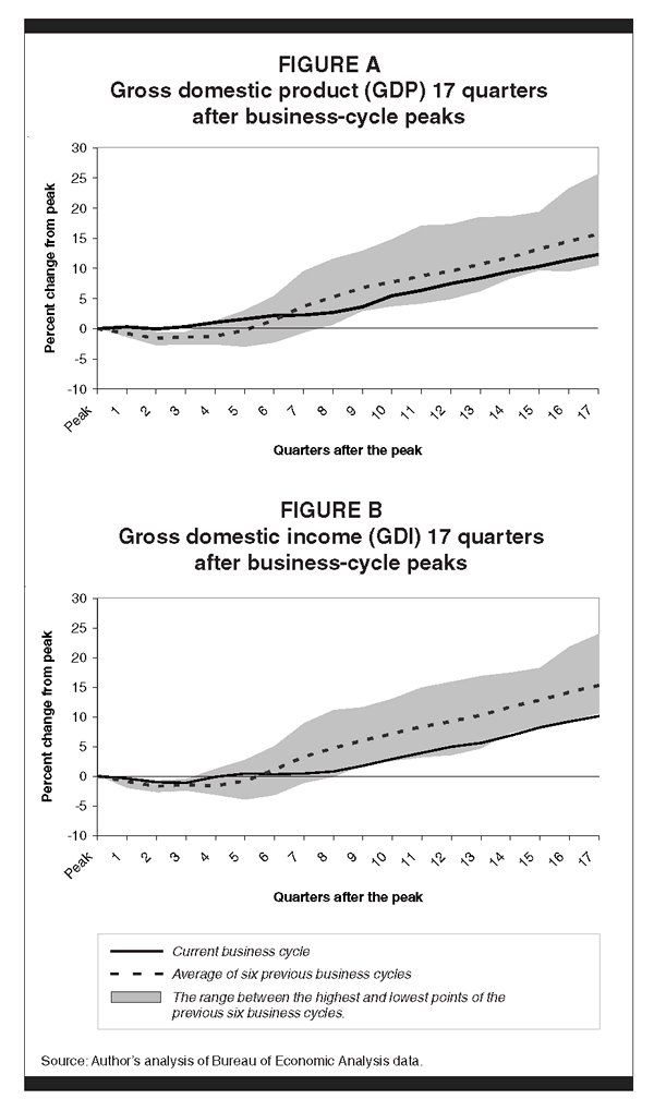
In order to illustrate the clever data manipulation, I'm going to focus on the first set graphs that appear in the paper which I've reproduced here (click on the images to enlarge).
The graphs compare "the current business cycle (since March 2001) to comparable 17-quarter (and, in places, 54-month) periods for all previous business cycles dating back to the late 1940s (when these data first began to be collected)." The author was not kind enough to identify the starting year and quarter for each the previous business cycles, but I was eventually able to figure it out, and using GDP growth data from the Bureau of Economic Analysis, as shown below, I am able to exactly duplicate the data in the article's "FIGURE A" as shown below:

The author happens to find 6 "comparable" previous business cycles since "the late 1940s." But there were more than 6 business cycles in the last 60 years. It took me awhile to match the data, and it turns out that the "comparable" business cycles that the author chose were the ones that went for at least 17 quarters without going into another recession. It turns out that those recoveries were the six strongest recoveries since data began being collected.
So Bushonomics has to complete with the best, as opposed to any run of the mill, recovery. Fair enough. Let's strip away the gray range and look at the underlying data for the individual recoveries (the heavy black line represents the current recovery in all of the following graphs):
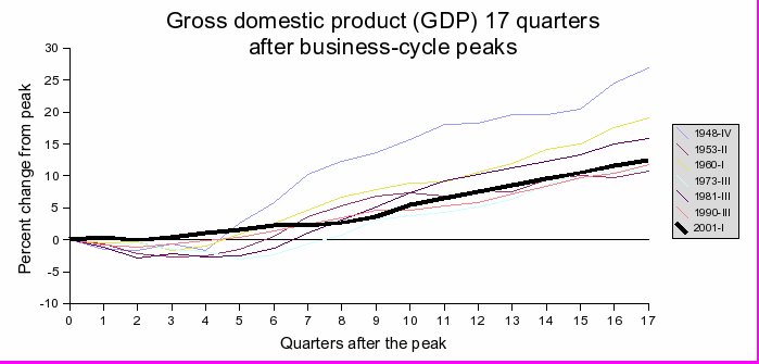
The first recovery started in the late 40s and is depicted by the bluish line at the top of the graph. As you can see, this recovery was an outlier with the rest much more tightly clustered near the current recovery. Fundamentally, it's also an outlier in that we had just gotten over a depression and a huge war, we were rebuilding Europe, etc. It also is the oldest recovery with the oldest data and the most subject to variations due to time when comparing it to the current recovery. So I think it's pretty fair to eliminate that recovery. So, instead of the 6 best recoveries starting in the late 1940s, we'll compare the 5 best recoveries since 1950 to the most recent recovery:
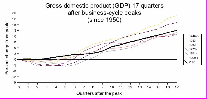
The only recoveries in this set that were doing better after 17 quarters than the current recovery were the ones which started in 1960 and 1981. What's interesting about that is that those two recoveries had substantial tax rate cuts associated with them: the Kennedy and Reagan tax rate cuts. The irony is that once we strip away the masks that the author used to hide the basic information, not only does the data not support his hypothesis, but it actually provides evidence that the best and longest lasting recoveries are associated with tax rate cuts - in other words it shows the exact opposite of what he's trying to prove.
But we're not done yet. Another misleading technique the author used was his choice of statistics. Real GDP if a fine statistic if you're comparing one year to the next. But GDP is strongly affected by population growth (larger populations generally have larger GDP) and, because population growth varies over decades, it is a poor measure to use when comparing GDP numbers over long time spans. Indeed, the population growth rate was significantly higher in the past and has been slowing steadily which would tend to make past GDP growth higher relative to more recent GDP growth numbers. A much better number to use is real GDP per capita. The following graph is the same as the previous one except it uses changes in GDP per capita instead of changes in GDP.
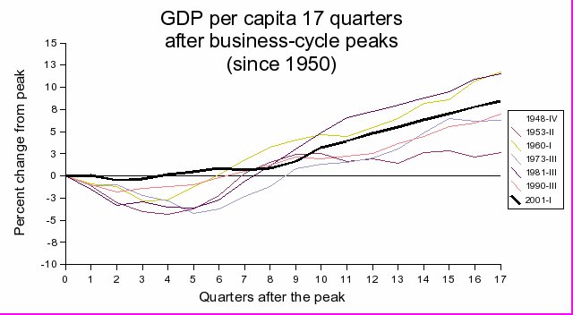
As you can see, the recent recovery looks even better relative to those recoveries not associated with a tax cut.
The bottom line is that the author used data that actually supports tax cuts and contradicts his conclusion, but by clever picking of time frames and statistics, and masking the underlying trends, is able to give the strong impression of the exact opposite position. The rest of the data in the article has similar and related flaws which I may address in a future post.
2 comments:
It occurs to me that the tax take as a percentage of GDP was much lower in the post-WWII expansion compared to the later expansions - and it was the big outlier on the upside, hmmmmmm? This was true even with very high marginal statutory rates because: there were many deductions, exemptions and loopholes; income thresholds for the high rates were very high: and capital was taxed lightly.
That is interesting. Indeed, I've modeled the rate of GDP growth using a combination of the increase in tax take as a drag and a Kurzweilian accelerating exponential as a boost and it actually looks pretty good.
I suspect the same model would actually work for continental Europe as well. I'll publish something on that as soon as I can.
Post a Comment